
I recently started working on a design system using ShadCN, an open source React component library. I joined towards the beginning of the project, where the code base had already been started and some early decisions had been made, like using ShadCN. I came in with the job of spearheading the design system, customizing the components for our brand and needs, and getting the Figma file ready for our design team to use.
Check out my previous article to hear more about why we chose ShadCN and what it was like getting started with the library.
Setting up the Figma file took some trial and error to get it more or less matching with what's in our code base. This post is going to get a little in the weeds documenting what I've learned. It's basically the tactical article I wish I had 6 months ago when I was just getting started with ShadCN.
Getting Started
I found an open source ShadCN Figma library from Obra Studio that saved me a ton of time building out individual components from scratch. And it was really helpful being able to hand the design team some assets to get started, while I worked on customizing and adding in our brand styles.
I started out by adding in our brand raw colors. We had a pretty minimal palette in our brand guide — lots of grays and reds — so I figured we'd need to add in some colors for our software. But I wanted to start minimalistic and just add when we needed it, as opposed to starting with tons of options. I didn't want to overcomplicate things and confuse people.
Theming
I knew that our new design system needed to support light and dark mode, and I also did not want every designer and developer having to think too much about light and dark mode. They have a lot going on. This is a complicated software product. Thinking about theming is my job. So I knew I wanted to set up the system to make the themes as painless as possible for everyone else.
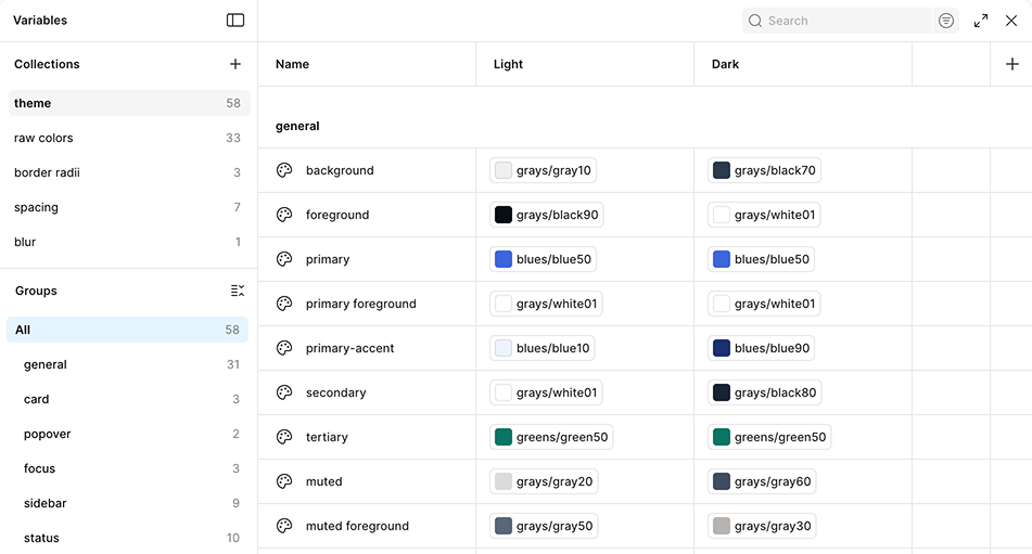
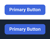
Luckily, ShadCN is set up with light and dark theming already. I started mapping our brand colors onto the thematic color tokens that come with ShadCN. For example, ShadCN has a “primary” token that's used for its primary button. The default primary color is black on light mode and white on dark mode. We wanted our primary button to be blue, so I mapped the “primary” token to blue50 on both modes.
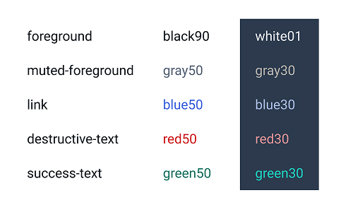
I've mostly stuck with the original ShadCN theme token structure, but I did add a few new themed tokens as they came up. For example, I made some tokens for different colored text (red, blue, green) that passes color contrast accessibility on both light and dark modes.
Token Maintenance - Keeping the code and Figma synced
I looked into using tools like Token Studio or zeroheight to dynamically sync color tokens between Figma and the code base. I know many systems are set up this way to allow a designer to update the color tokens in Figma and then push the changes to the code. In the end, I just decided to manually update the color tokens myself. I have Figma access and code access, so maintaining these manually seemed easier than trying to set up some sort of complicated pipeline. When I make a color update in Figma, I just copy and paste the new hex code into the code base. Also, this design system is for a small company supporting one browser-based software. I think a dynamic setup would be more useful for a big company supporting lots of sites and apps. We'll see long term if it was the right choice to make manual updates, but it's working fine for now. It's not hard to coordinate with myself.
Figma Tokens: Close but not the same
One of the nice things about Figma is that it's getting us designers closer and closer to the code. But one of the problems with Figma is that we are close enough now to the code that we are wishing it was exactly the same. Unfortunately, the Figma tokens are not set up exactly like the code, so I've implemented a few hacky workarounds, particularly around theming. Like I mentioned, setting up the Figma library to support light and dark mode automatically is one of my top priorities for the system.
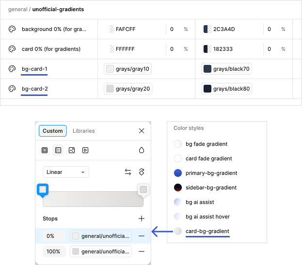
ShadCN uses Tailwind for styling, and Tailwind lets you make some customizations that aren't supported in Figma variables. Because of this, I've made a whole section of “unofficial” color variables in Figma as a workaround. I learned this strategy from the Obra Studio file. It's not ideal. I wish the tokens could all be 1-to-1 with the code. But it's the best solution I've found. Let me give some examples.
Gradients
The color tokens are all set up as Figma variables, but Figma variables only take solid colors, not gradients. 😞 However, Figma styles do take them. In order to get the gradients to work on light and dark mode, I set up the solid colors in the unofficial Figma variables, and then set up the gradients as Figma styles. This is a lot more straightforward in the code base, where color tokens can be gradients.
Opacity
In Tailwind, you can modify the opacity of a color like this:
className="bg-background/50"
Which means use the “background” color token for the background color, at 50% opacity. You don't need a separate color token to support this. But in Figma, you can't change the color opacity without detaching the color variable, and if you detach the color variable, the theming no longer works. 😭 So under my unofficial Figma color tokens, there are ones like “background 50%” and “background 30%.”
Dark mode specific
Another thing that Tailwind lets you do is write conditional styles, including styles that only apply to dark mode. Normally, when you write "bg-background" in the code, that means that the background will get whatever color has been set for the "background" token, usually white on light mode and black on dark mode. But you can also write specific styles just for dark mode.
className="bg-background dark:bg-primary"
This means that the light mode will still get the background color, but the dark mode will get the “primary” color instead. It lets you override the styles in specific cases where you want something different. This is very useful in the code, but Figma doesn't support this, so more unofficial tokens.
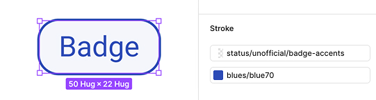
Let's see a specific example. Here, the badge component is designed with a color border on light mode, and a white border on dark mode.
That's easy in the code. It looks like this:
className="border-blue70 dark:border-white"
To get this to work in Figma, I made an unofficial token that's white on dark mode, and white 0% opacity on light mode. And then the component gets 2 borders: the colorful border for light mode, and the unofficial token as the top border color. This way, the white border only appears on dark mode, where it covers up the blue border. And on light mode, the blue border displays because the white border is opaque. (🫠 Is this giving you a headache yet? It certainly gave me one.) So the Figma component successfully matches what we have in the code, even if it's set up differently under the hood.
How's it working out?
So far, so good. The product designers are using the Figma component library, and the light and dark mode set up is working great. One downside is that all these unofficial tokens in the Figma library are understandably a bit confusing to the consuming product designers (who haven't been staring at this for months like I have). I've addressed this just with training and documentation. And luckily they are a smart crew.
Overall, I've succeeded in making the Figma components a close match to the ones in the code base. I just released a brand color update to the design system in both Figma and code. That was my first big test of the way I had set up the system and the color tokens, and I am happy to say that it went very smoothly. 🙌