
There are a lot of advantages to using a 3rd party design system library. In the right situation, it can help kick start a project and save a lot of design and development time. But it's not the right fit for every project, and it's important to understand what problems it can and cannot solve.
Let me start with a story. A few years ago, a higher-up in the tech department got really excited about using Material UI (MUI) for our design system. We already had a robust design system that we had custom built, and it had worked great for a while. But we'd suffered staff cuts during the pandemic, which affected our ability to maintain our design system. It was in need of some updates, and our hard-won buy-in for the system had lost traction at the company.
Our tech guy wanted to help, and decided the perfect solution was shifting to a 3rd party library. The idea was that MUI would be a shortcut that would solve all our resource problems. We'd just swap out our current components for MUI and be done with it.
Of course, this didn't work, because the underlying problems weren't with our base components. We had an ecosystem problem, and we were instead addressing a surface-level update that didn't provide much value and actually was a lot of work for other teams to implement. This ended up further eroding trust in our system and our team.
Fast forward to 6 months ago. I had just started at a new job as design system lead. The team was working on a new browser-based software, and had already gotten started setting up the design system with ShadCN, another open source React component library. Visions of previous failures danced in my head. But this was a different situation, and I wanted to stay open minded, collaborate with the team, and understand the goals that we were trying to solve.
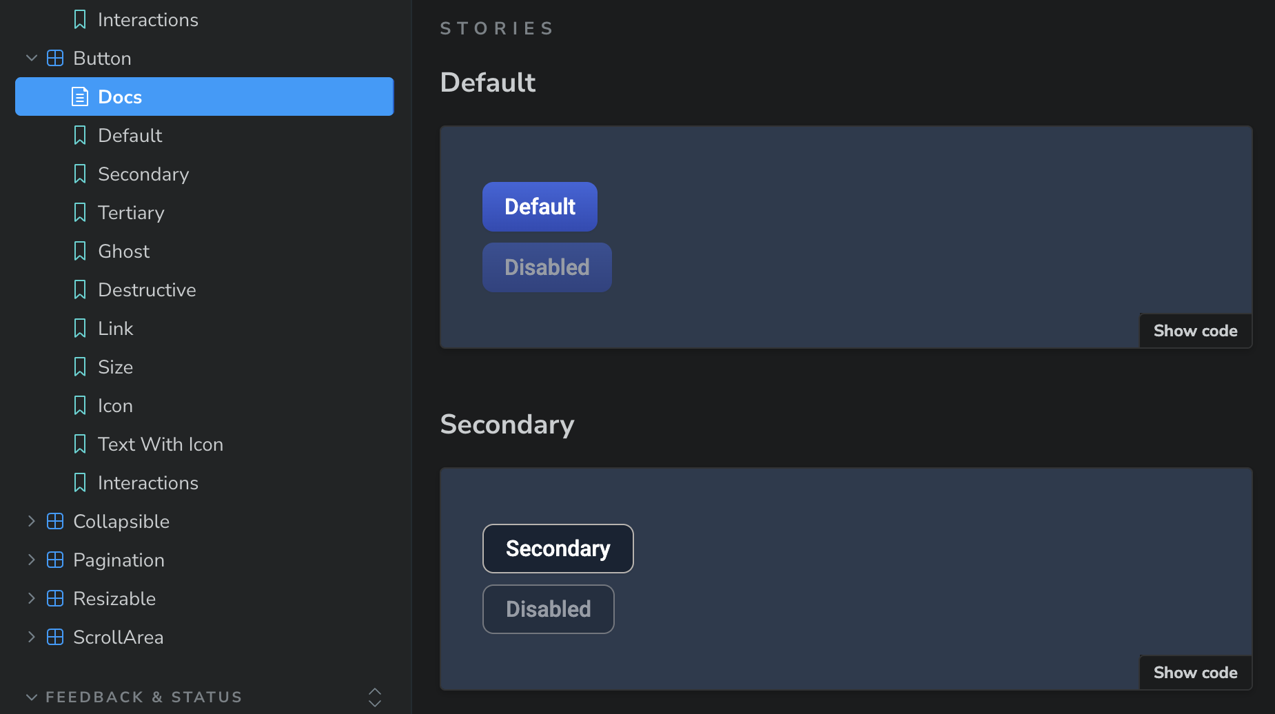
For this project, unlike my last job, we were starting from scratch, building a new design system to support a new software. My new company is relatively small. We have a million things to do in order to get this new product launched, and we wanted to hit the ground running. Using ShadCN saved the team a lot of time by giving us basic components like buttons, form inputs, and tabs that we could start using right away. The ShadCN library doesn't have everything we need. We are adding in some custom components too. But it gave us a great place to start. And ShadCN is customizable, so I was able to go in and add our brand styles to the system, but that wasn't a blocker to getting started.
And this worked with Figma too. I found an open source ShadCN Figma library from Obra Studio that saved me a ton of time building out individual components from scratch. And like with the coded components, the design team could get started using the Figma assets right away, while I worked on customizing and adding in our brand styles.
This is my first time using ShadCN, and I talked with some of our engineers to better understand why they chose this particular library. They told me that they evaluated multiple options, but this is the one that ticked the most boxes.
- Built for React, which we are using.
- Generic base components that match our needs and are highly customizable.
- Good functionality, accessibility, and documentation.
- It's not a dependency. We forked our version, so it's not dependent on the overall ShadCN system. When they make updates, we can choose to take them if we want, but we don't have to. This makes the system more customizable, plus it's one less dependency that we have to periodically update.
Learning ShadCN
I threw myself into learning about ShadCN, and overall, I've found it pretty straightforward to use. I'm a designer who codes, so I work on the Figma library and the code base. Being able to dig into both has given me a better understanding of the way it's set up. The documentation is pretty good as well. ShadCN uses Tailwind, which is a CSS framework, so I've been learning that too.
Here are a few things that I am really liking about the ShadCN library so far:
- I like the minimalist way the color tokens are set up. The system uses a lot of opacity changes for hovers and other states, so you don't need so many colors in your tokens. Seems clean and elegant.
- The functionality is separate from the triggers, so you can have different elements (button, icon, card, etc.) trigger something like a popup or tooltip. That setup seems nice and flexible.
- Most of the AI tools right now are using React with ShadCN to make their prototypes/sites. As our company is leaning more into using AI for designing and prototyping, using the same system is helping the AI to use and match our design system better.
Takeaways
Using a 3rd party component library for this project has already gone a lot better than my previous experience. Incorporating the library at the beginning of a new design system has been a very helpful way to jump start our project. Third party libraries can be valuable if you use them in the right way for the right use cases. They aren't a magic bullet. You still need resources for your design system. And they aren't going to be the right fit for every project. But in the right circumstances, they can enable teams to get started on a useful system relatively quickly.