
This case study is adapted from a talk I gave at World IA Day DC and DC Sketch Meetup with other members of the U.S. News design team.
The Project
Redesign the U.S. News & World Report website using a centralized, maintainable design system.
The Team
6-7 member in-house design team.
Background
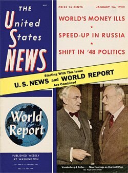
U.S. News has been around for a long time. The company was started in 1933 as a print publication. Over the years, U.S. News has adapted to a changing market. The website launched in 1995, and the company went completely digital in 2010.
This long history means that we have a lot of legacy content and systems. We have many established products and stakeholders, and our content comes from multiple content management systems and databases.
Redesign, take 1
In 2015, the company began a site-wide redesign. The main goal was to make the site responsive. As more and more people were accessing the internet on their mobile devices, it was clear that a responsive website was needed to stay competitive. Many other media sites were already responsive by 2015.
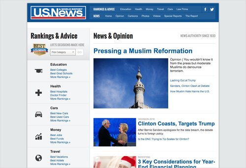
In addition to making the site responsive, the company also wanted to update the site design to look more current and establish more brand consistency across the different products.
At the start of the redesign, the design team did a brand inventory of elements across the site and found that the brand consistency was not good. For example, we had all of these slightly different button styles. It wasn't brand consistent, and designers and developers were spending time building basically the same thing over and over again.
This new redesign would work to address the lack of centralization.
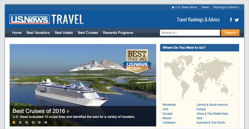
I got hired onto the team in early 2016. At this point, the team had just launched the first pages in the new redesign. Each designer works with a specific product (News, Education, Travel, Money, Health, and Cars). I took on the Travel team and got to work building mocks in Photoshop and working with a team of developers to roll out the new Travel pages one by one.

Redesign, take 2
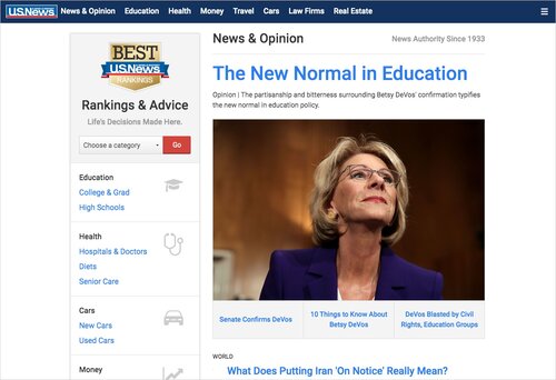
By 2017, we were still hard at work on the responsive redesign. Over half the site was now in the new design. At this point, the C-suite came to design leadership (John Mirick and Katie Sokolosky) and requested that we update the site to make it look more premium in the hopes of attracting advertisers. Originally, we were just going to slap some CSS changes on the current design, but instead, John and Katie decided this was a good opportunity to evaluate the process and figure out what was and was not working.
Looking at the current state of the redesign, there were certain aspects that had greatly improved. We accomplished the original goals:
- Make site responsive
- Update design to look more current
- Establish more brand consistency
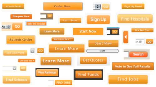
But going through the process of designing and building out the new pages had made clear some limitations as well. First of all, even though our style was now much more consistent across the site, the system was still decentralized. Different parts of the site were still in different legacy codebases, and we were still duplicating a lot of work.
For example, these two carousels on different pages look similar, but each one had to be built separately. We were still doing duplicate work.
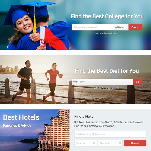
In addition, these similar elements lost consistency over time because there was no system in place. For example, we placed hero elements on the top of many landing pages. At some point, we decided to update the design. Diets and Colleges got the updated design, but Hotels never did.
Takeaways and Next Steps
In hindsight, one of the issues with the first redesign was that the teams were so focused on getting it done that we did not take the time to establish a robust, maintainable system. We would approach the process differently for our second redesign.
To get started, Katie worked closely with the development team to establish some new goals for our system:
- Common vocabulary
- Encourage reuse
- Prevent duplicate work
- Better requirements
- Ability to iterate and polish
- Faster development
- Modernize our stack
It was decided that the best way to accomplish these goals would be to build a centralized, component-based design system.
Introducing Atlas
Our new design system, dubbed Atlas, would get the entire site on the same codebase, using React to set up a centralized, component-based system. To ensure that design and tech are all using this system, we needed a reliable, single source of truth to facilitate communication.
Mirrored component libraries
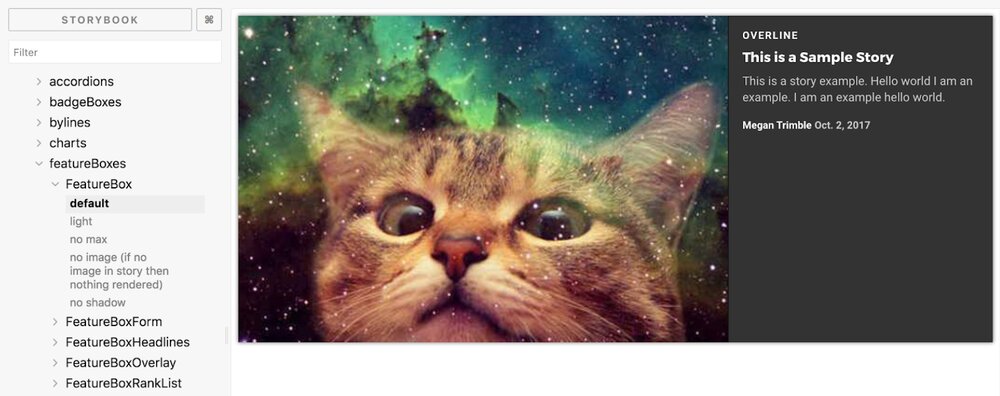
Now that the U.S. News site was going to be rebuilt into a centralized, component-based system, we needed up-to-date, consistent documentation. On the tech side, all of our components live in a Storybook library that is accessible to everyone in the company. Storybook is live code and contains all of the components that are on the site.
On the design side, we have a mirrored library of all of the components built in Sketch. Before Atlas, the design team had used Photoshop to build all our mocks. We had talked about switching to Sketch before, but our system was too entangled with Photoshop. Like the live site, our Photoshop mocks didn't have a centralized system. We would copy elements from other files, but it was hard to know what was the most up to date and mistakes would quickly propagate.
Atlas presented us with a chance to change our process. We switched to Sketch and created a centralized library of Sketch symbols that everyone on the team could use. Now when one of us pulls down a component into our files, we know that it is the most up to date version.
Librarians
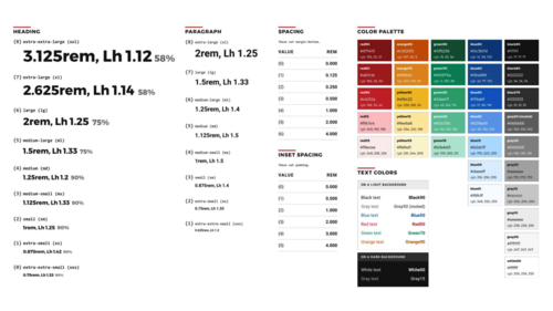
As you can see, the design and tech component libraries match up. They contain the same components with the same styles and the same names and organizations. We have two librarians — the Director of Design and a Senior Developer — who are in charge of this process of naming and maintaining the systems. With these mirrored libraries, we can ensure that design and tech are speaking the same language.
2021: The State of the Redesign
We're still working on the redesign, but we're hoping to have the site 100% in Atlas by the end of the year. Compared to the blue responsive redesign, Atlas was a lot more work upfront, but all the extra work is really starting to pay off.
The Good
Greater collaboration and communication
Tech, design, and product now have a shared system with a shared vocabulary.
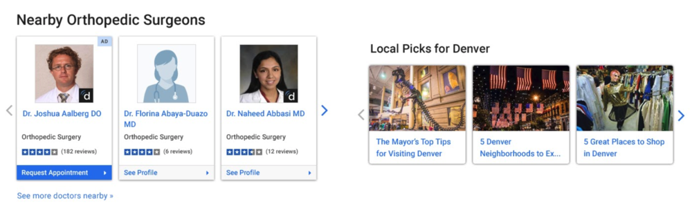
Reusable symbols and components
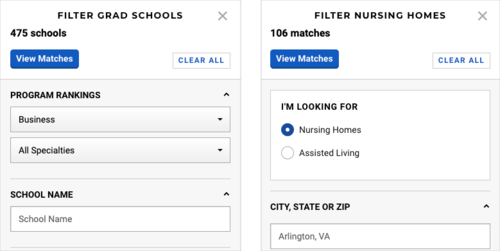
Here is the same search filter component — SearchHUD — on Grad Schools and Nursing Homes. Reusability has led to more efficiency and consistency. This SearchHUD functionality has already been figured out. No need to reinvent the wheel.
Products have access to the work of other products. When one team spends a lot of resources building out a complicated, interactive map, this work is now available to be used by other teams as well.
Increased attention to detail
Reusability has allowed us to spend more time improving the components that we already have. We can justify spending more time on details when we know that the work will pay off everywhere. We've been able to spend more time adding improvements and polish like hover states, accessibility updates, and site speed enhancements. The centralization of the system means that this work no longer falls on individual teams with limited resources.
Faster development (now that the system is in place)
The centralization of the system has led to faster development times and fewer rounds of feedback. We can spend more time building new features and less time rebuilding small things that have already been built elsewhere.
The Challenges
We have gotten a lot of wins from Atlas, but there have been challenges as well. As I mentioned before, the centralized system took a lot more upfront work than blue responsive. There was initially some skepticism around the office about taking so much time and resources for yet another redesign, and it took some evangelizing on our part. The reuse has also led to product owners feeling a little less in control of some of the styles on their own pages, since we've worked to reduce component variations.
And while we do share components all over the site, we've found that there are limitations to reusability. The different products at U.S. News have a number of different requirements. For instance, Travel is a very image-heavy section, where Investing needs a lot of charts and graphs, as well as tooltips explaining the complicated terminology. Ultimately, we've had to build more components to accommodate these requirements than we initially anticipated.
How have we addressed these issues?
Communication and Flexibility
The design leadership has done a very effective job of communicating to the rest of the company. At the beginning of the redesign, they went around to all of the product teams and explained what the redesign was and how the process was going to work. They set up realistic expectations for the work that was going to be involved, and also explained the benefits that we all would eventually get from the system.
Throughout the implementation of Atlas, the teams have been constantly reevaluating our processes and making changes. We did a lot of research on how other companies have implemented design systems, but if a process is not working for our team and company needs, then we will change it.
Design leadership also organized a number of opportunities for feedback. We sent out surveys and held open forums to solicit feedback and listen to concerns from everyone. And then most importantly, we made changes to the process based on this feedback. This open communication helped to get everyone throughout the company involved from the beginning and be a stakeholder in the success of the redesign. And by incorporating feedback, we were able to improve our processes as well.
Changes Based on Feedback
Feedback from Product
CSS regression testing
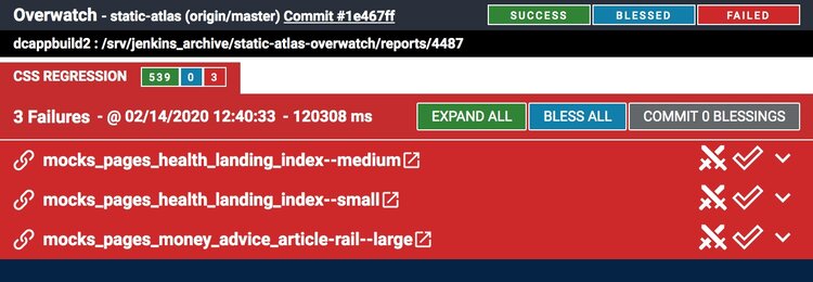
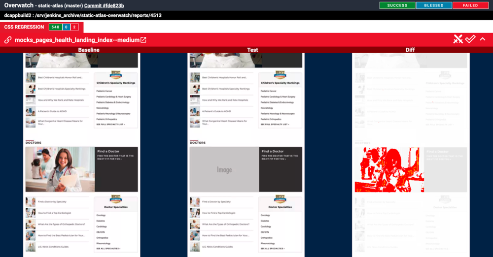
When we first started launching Atlas pages, due to the centralization of the new system, sometimes an update for a new page would inadvertently also show up on another page by mistake. We would not always notice it right away, and this lack of control was understandably really freaking people out. Fixing this issue was a top concern from product teams. In response, the tech team built a CSS regression testing tool that checks all our pages before a launch goes out and identifies any pages that have changed.
Tech uses the tool to identify any changes that were not expected, and then is able to fix the pages before these changes go live. Here, you can see the tool has flagged a lost image on a page.
Page speed testing
Page speed is an important metric that has a significant impact on our traffic. With the switch to Atlas, product managers wanted to be able to monitor the page speed changes. In response, the tech team implemented some page speed testing tools that were able to scale across the whole site.
Communication
We also have started communicating global changes to everyone before they launch. For example, we updated the font on the headers that are on every page on the site to increase legibility. We let everyone know in advance so that people would be expecting the change and not think that it was a bug.
The design team has also done a better job of communicating Atlas successes. From feedback from product teams, we learned that everyone was hearing about anything that went wrong, but that they were not hearing about things that were going well. In response, we have been increasing communication about new features that are now available for reuse and improvements that have launched site-wide.
These process changes have improved our system and greatly increased everyone's launch confidence.
Feedback from Tech
Component refactoring
It was hard to predict from the beginning all of the variations that we would need for the different components. Some of the components ended up with a lot of excess code, and the design team has been working with tech to reevaluate and refactor some of the components to remove bloat.
Documentation
The design team was spending a lot of time building out detailed component library documentation. We learned from feedback, however, that no one on the tech team was using it. The documentation had been useful at first when we were just starting out, but once Storybook was up and live, that had become the source of truth that everyone was using. We realized the component library documentation was no longer worthwhile, so we got rid of it.
Inspectable mocks
Right now, design delivers static mocks to the developers. We have had a number of requests for inspectable mocks, where you can click in and see specs like color, text size, and spacing. This request is something that we have been looking into, but we have not yet found a viable solution. There are some tools available, but they do not work well with some of the Sketch plugins that we are dependent on. There are some new tools coming out, and we are in the process of testing them to see if they will work for us. The goal is that inspectable mocks will lead to fewer rounds of feedback and faster development times.
Feedback from Design
Building a design system from the ground up has been an interesting experience. Atlas has been a collaborative process, with everyone on the design team contributing to the system. We have been constantly reevaluating and updating our process as the system has taken shape.
Creating a Sketch library took a lot of upfront work, which we had anticipated. Something we had not anticipated is how much maintenance our library has needed as the Sketch tools we use are constantly being updated. Sketch has a lot of plugins available, and we have relied heavily on these to build out our complex and flexible symbols. But we have also found that the more plugins we have, the more things can break when new updates come out. As Sketch has gotten more advanced and released new features that were previously only available as plugins, we have been able to remove some of these plugins. While relying on fewer tools should help, we will probably continue to need resources to maintain our Sketch library.
A process change that I initiated is adapting how we choose what components to include in our Sketch library. Originally, everything in the Sketch library was a perfect 1:1 with everything in Storybook. This process worked great for about 90% of our components. However, some of the Sketch symbols we were building were not actually being reused. We decided that for components that were very specific one-offs, it was not worth the time it was taking for the design team to be building them into reusable Sketch symbols.
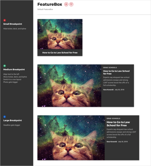
For example, most of our products have these search/ranking pages that use what we call DetailCards to present each item in the list.
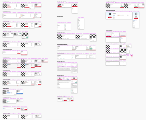
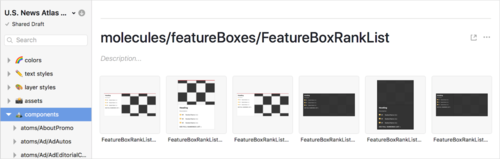
Even though these DetailCards seem reusable, what we actually found is that each product has specific data requirements that means each of these has been built as a separate component. They look similar, but they are not exactly the same. Originally, we were building out the individual DetailCards in Sketch to match the ones in Storybook. These are all the DetailCard Sketch symbols in our library file.
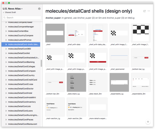
These complicated symbols were time consuming to build, were bloating our library file, and ultimately were not being reused at all. Instead, we got rid of the DetailCard symbols and started using generic shells that can be personalized for each product.
The DetailCard components still exist in Storybook, but they no longer match 1:1 in the Sketch library. These types of process changes have greatly improved our efficiency.
I had read a lot about design systems in other companies, and it has been very interesting being a part of this process and seeing it take shape. We will continue to make improvements to our system. The hope is that our new U.S. News Atlas design system is robust enough to last a long time and grow with the company.